Thursday 11 December 2014

Dichotomy Project Post-Mortem

Final outcome

It's finally over and we may rest easy once again, for a few weeks anyway. It's no secret this project has been a persistent monkey on my back and I've been really unsure through this whole process but I did like what I finally ended up with.

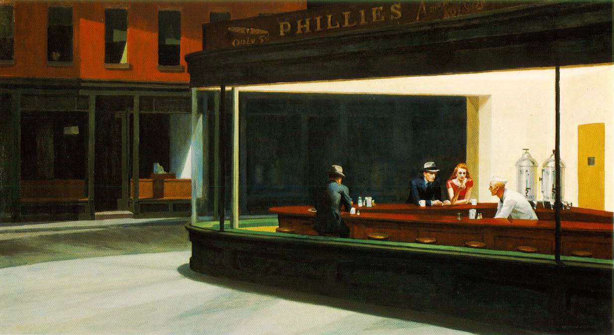
Stonewall and Gambit
Overall they still have things I'm not completely happy with, mostly with my textures and mostly with Stonewall the white Bishop. The tone of the yellow on his body washes out into the white far too much and it makes the details harder to see. Gambit despite being textured in the same pattern feels like his colours are broken up more successfully and they sit together a lot better and clearer. It was also pointed out at the final presentation that the opposite tones on the shoes draw the eyes down towards them as the pure colours seem to demand attention.


In response to is I did a quick paint over of the render using shades of grey so that they colours weren't quite as strong. I to me looks like I'd have to spend some more time to get the shades correct but the alteration does seem to help balance the colour more and helps separate them from the board they're standing on.

The project over all

Regardless of the finished piece I don't think I handled this project as well as I should have done. I spent too long working with the concepts and even longed doubting any of the work I produced which greatly slowed everything down. 

As for the transition from 2D to 3D my models were quite close to identical to my plans and orthographic images so was happy with this aspect of my work and I wasn't required to alter my tri count for the models to get my desired results. I had wanted to get a bit more depth into the diffuse texture and get the glow maps working for the eyes but I was required to prioritise other things.  


Even with all that once the dust settled from concepting nightmares and deadline changes I laid out a work plan for the time frame I had left and was able to stick with it more often than not, apart from a few hurdles at the end which affected the quality of the model rigging. 
For the next project my main goal will be to not trip myself up with concepting for disproportional amounts of time once again and to have a bit more confident to avoid hesitating the point of being static. 

Monday 8 December 2014

Bishop Modelling Continued

It's been a long project but the end is finally in sight. This is just an update to add onto the last post to cover the second character. Both characters are modeled and textured and all that is left is to use the extra time to rig the characters and produce quick props and a base to use in my renders. Overall I do like the designs but I think the black bishop works better of the two, his silhouette seems stronger and his colours work better together. I look forward to getting them side by side in a scene and wrapping this project up.


Wednesday 3 December 2014

Bishop Modeling

Modelling for the rest of the week and the weekend went with no problems. Having modeled the white bishop I could carry the model over and swap out the head pieces then use the various tools to make the other changes to produce the second character. 


I set a budget of under 3000 tris for each model. The white bishop finished at just over 2500 and the black bishop was under 2700. I cut the count down as much as I could to the point where anymore changes would change the shape of the model, though I did upset the topology on the head and feet in an attempt to lower the count..  
I used the symmetry modifier to cut down of modelling time and the time spent working on the unwrap but got to the texturing stage and realised my texture design was asymmetrical so couldn't overlay the UVs and had to go back and repack them a few times. 

I initially created a PBR map for the white bishop but the result wasn't the cartoon like feel I was aiming for so I returned to diffuse and specular maps. 

Uvs, Diffuse and Specular map
I also intended to use a glow map to try and get a slight glow on the eyes so they didn't look so flat and painted on but I couldn't manage to get the map working in 3Ds Max so I abandoned the idea. I had planned to just finish off the texture for the second character in the next though days but the project was given a extension so I should have time to rig the models and create props to use in the renders. There's still work to do but it's nearly at an end and I really look forward to a break for Christmas.

Wednesday 26 November 2014

Abandon hope all ye who enter here

The week so far has been rough with 40% on my time spent still working on a concept and the remaining 60% screaming into a pillow about my concepts. I've over thought everything to the point of feeling completely lost in it all. I don't seem to be the only thing getting a little lost, dichotomy itself seems to have gone on a journey through Chinese whispers about how different the characters actually have to be and there seems to be a huge focus on scale (no pun intended), leaving me fairly certain once again about my design as sitting in a room full of people who say it's not different enough tends to do.


After returning to the shapes again I instantly hit the same unyielding brick wall of seeming not to move forward. The ideas just weren't coming and by midday Tuesday there wasn't anytime to dwell on it any longer. I hadn't walked away with a lot of ideas for the shapes so with my minimal options I went with what I thought was the strongest one being, chess. A lot of the shapes reminded me of various chess pieces and by this point I needed something to go with.

Face Off dichotomy
Having been showed an episode of a special effects show called 'Face Off' by one of the tutors in the Wednesday lecture, where contestants had to design a pair of characters that were basically, good and evil but clearly belonged together, I took from it my idea would work well as a dichotomy to have these same pieces that must play for different sides. I designed a few different pieces, mostly the Bishop and the Knight and decided the Bishop had the most potential to work with in terms of shape and design.
This also fit well into my time frame. I'd lost a huge amount of time struggling with the concepting stage and now had a small window for modelling. I wanted to make both characters, it seemed redundant to me to design a character whose purpose is to be in a pair and to only have the one in the end. The overall similarities of the designs mean I can carry the first model over and make alterations instead of making a whole new model from scratch.


I moved through the rest of the work fairly quickly and didn't get to explore as much as I could with the costumes. My main focus was trying to make sure the tonal values from the first character was inverted for the second to create that link between them with the colour palettes. 


My final colour choice was purple and yellow. Since nearly everyone when asked selected the purple for the black bishop I wanted to use the contrasting colour for the white. With the orthographic images complete I can finally move onto the modelling which after all this trouble with 2D will be a much welcome break.. 

Sunday 23 November 2014

Week 8: Character Dichotomy

Batten down the hatches, we've got a character project.
What doesn't feel like a particularly easy project either. Three weeks to design a dichotomous pair of characters and model one (or both) of them. My last work with characters was a slightly boxy gladiator so this feels like very deep water but I guessed if I flail around enough it could pass for swimming. 
   
Dichotomy: A division or contrast between two things that are or are represented as being opposed or entirely different.


So characters who are opposite or different but still fit together and clearly share a world and we also have completely free rein on subject, style and tri budget. It was at this point my frantic flailing starting turning into drowning. As if predicting this would happen our first class was on idea generation and how shapes can be used to depict traits about characters as commonly seen in Disney and Pixar movies. 


Behold! The Villain Chin!

Starting with basic shapes and their stereotypes for idea generation, circles for friendly, lovable characters, square for big and strong, triangles for clever, agile characters etc etc. 


Warping and combining the shapes in different ways to get various new shapes and silhouettes which had potential to become characters. We'd used this method of brainstorming before but it was for vehicles, which it seemed to lend itself to a lot better or maybe it was just me but after a while working like this, I didn't feel like I was getting anywhere.
After giving more hours to simple shapes than no sane or productive person should, I came to the conclusion I wasn't getting useful results and backed off from the shapes to return to work with the mood boards. I decided that this project was just going to sit stagnant unless I developed some kind of idea to give me more direction. That by itself was easy said then done without tumbling straight back into the sci-fi and fantasy comfort zone.
With my work flow and time management swiftly spiralling out of control I got to the point where I was willing to settle for an idea, any idea. I begrudgingly went with the idea to use an established dichotomy of cat and dog and was hoping to create a successful anthropomorphism from the two, planning for a male and female that would have characteristics of their assigned animal. Trying to return to the lecture on shapes I'd planned idea such as triangles on the female cat character to give the impression of being sleek and agile.
I did some quick colour work just to begin exploring that so I'd have a bit more to talk about for the presentation but the silhouettes were still not correct and don't say what I need them too. You could probably pick out characteristics if I told you want they were supposed to be but other than that they're just reading as generic people. The feedback from the presentation was pretty much similar to this and I was advised to either return to my initial shape work to try to Photoshop various parts of cats and dogs together as a new base for silhouettes to try and get more of their shapes in there.


I'll most likely be returning to the shape work, I hated this concept and need very little convincing to scrap it. This project has gotten to a particularly slow, painful and directionless start  so I'm hoping the tides might turn next week. 


Friday 14 November 2014

Sentry Gun's final week

As the deadline passes its time to say goodbye to the Sentry Gun at least until we revisit it after Christmas. It's been a fun project and since I'm not completely overjoyed to see the back of it I take that as a sign that it went quite well even if the last week did start to cut it close. There's been a lot of back are fourth between 3Ds Max and Unreal these past few days trying to get the pivots to sit right thanks to a few errors in my modelling for the base but that sort of got worked out in the end.


There was also some finishing up of the texture maps trying to iron out some of the weaker aspects of them, I didn't quite get them to what I wanted but I'd pushed the time I had to spend on texturing to the limit and it was time to move on. It was quick job to model and texture a projectile to work with the gun. The idea behind my gun design was a sentient insect creature that had been spliced into mechanical parts, to try and stick with this I made the projectile as a type of toxic stinger so unlike most sentry guns the danger of getting hit by it isn't immediate.

With everything I needed it was back into Unreal to finally get it firing. After adding a socket for the weapon fire I had to remove the collision mesh on the barrel to get the projectile to spawn correctly. I also made a few changes to the settings in the blueprint to remove the ejection port and slow down the right of fire,  reduced the angle of the yaw slightly to stop the gun pulling back too far and clearly detaching from the base.

In an attempt to keep working with my design of the gun being alive and sentient I connected up the emissive texture on the ammo dispenser and in the barrel to pulse, trying get something that looked like it could be breathing. Unfortunately there was a slight delay in fade in and out which I didn't have time to attempt to correct so I didn't fully get this effect I wanted.
In the last bit of my time I created a quick effect to switch out with the default red star for the mussel flash. We're due to revisit this aspect of the project after Christmas but it was a quick and simple change just so it had something a bit more organic and that fit with the colour scheme. As a final extra I connected up a sound cue to the weapon fire to generate a sort of spiting sound when the projectile spawns.


I'm happy with the finished model over all though I think I may have let my love of science fiction have more say that it should have and the longer I stare at the design the more generic alien it looks to me. Still, I'm glad I went with the organic design, I think it was a lot more fun to work than a mechanical gun would have been and the shape wouldn't have been nearly as interesting to model.


Saturday 8 November 2014

Alien Subject: SCP-09 - Sentry Gun

It's been a very long week. A week spent living in labs and seeing very little of the sun in an attempt to get ahead with the project but the closest I've seemed to manage is on track, somewhat at least. I was hoping to be ready to get fully set up in Unreal next week but the long process of texturing looks to be impeding on those plans. 

The modelling itself was relatively simple and only took a few days thanks to using splines to get a lot the organic shapes quickly and easily like the piping and the bend of the neck. The legs on the base were quick and easy too by modelling one and using the array tool to create instances that were uniformly spread out as a bonus. I intended for the design to be a creature that was metallic and organic parts spliced together so I kept the parts I would be texturing as flesh slightly asymmetrical.


I've spent a bit of time using Zbrush for adding detail such as texture to the skin. I used the feature in the program to apply the basic texture map so I could see the areas that would be alphaed out in the final model as was able to work around them.
To produce the normal map I exported out parts of the model that I wanted to detail, since the UVs of the legs of the base were overlaying I only needed to work on one of them. After re-importing the hi polys and using the projection modifier there were problems with the overlapping objects interfering with the normals of other objects so I had to bake out each piece individually and reconstruct the single map over in Photoshop. 


Since the design was for a bio-mechanical creature I tired to use the textures to keep these parts separate, keeping all the metals a fairly similar grey and using a particular purple for parts that would be classed as a shell or an exoskeleton and the lighter colours for the organic skin. I was hoping this in combination with the metalness and roughness map would create very obvious contrasts between the materials.

Albedo and Metalness maps


There is still some work to do in regards to texturing next week like the roughness map but I hope to get that out of the way fairly quickly and get onto the engine work. I've already imported the assets into engine for a dummy run and there were a few issues with the pivots that need some fine tuning but it doesn't seem like too much trouble at this point.

Sunday 2 November 2014

Week 5: Sentry Gun Project

It's much harder coming out of group work than I expected it to be, motivation is a lot scarcer when you're working on a project solo. Our next project is the Sentry Gun, taking a Unreal Blueprint for a gun we have free rein of the design as long as it has the four required components, so the 'Gun', the 'Barrel', the 'Yaw' and the 'Base' other than those we can pretty much go crazy.


While a lot of people seem to enjoy this freedom I'm usually happier with a more set in stone brief so I don't spent hours lost in hopeless confusion or possibilities or to keep me from going completely off the deep end. Luckily, Tuesday's class kicked us off with a lesson on 'Bash kits' though my page at the end of it was more so just a mess of silhouettes rather than a recognisable kit of any kind. Regardless I managed to throw some gun like objects together as a starting point and took note of the designs people were leaning towards when I asked for their opinions and selected six of these that I liked to keep working with. For a process that was meant to be rapid idea generation I know I spent fair too long on this stage. I've planned a week for each stage of the project so concepting, modelling and engine work and by the end of the first week I'm a little bit behind with things but I have the information I need to move onto the next stage so I hope to get some time to come back to it.


I went with a particularly organic design since I saw the potential in the shape to look into insects and other critters to develop the idea further and it started to come out very alien, whether this was a coincidence or my love of sci-fi subconsciously slipping me ideas I don't really know but at the orthographic stage my little sentry gun and I were in this together so there would be few drastic design changes if we could avoid it.   

With the orthos done I'm set for sending the next week modelling and here's hoping 3D Studio is in a good enough mood to let it go smoothly.  

Thursday 30 October 2014

Project Post-mortem

A lot went on with the film room project and as a bonus we broke the sun. So this is something to sum up the project and how I think we managed.

Initially, like a lot of groups this project didn't kick off well for us. Even with lighting problems and data lose picking a room to work with was still the biggest headache by far, it took a long time to sort something suitable and suitable in this case mostly meant interesting and achievable.

Concepting wasn't really given the attention it deserved, since we were working with already established designs we didn't really allocate official time into our planning for the concept work despite knowing how important this step is, a lot more time and effort will be going into this from now on.

There were several improvements I could have made to my work I feel. The bar asset for a start even after remodelling it had a quite noticeable difference in size of the red part of the underside of it. This causes a noticeable difference in our image to the original once we set the camera angle.    While I’m happy with my work with the emissive material the colours of the signs needed some adjustment such as the red in the sign on the window was much too light and would have benefited from being darkened. Finally the outside scene I was not particularly pleased with, it was interesting to see what could be achieved with just normal maps, smoothing groups and metalness maps such as with the center building but the basic geometry I used is still quite evidently basic geometry. It’s texture could have also benefited from a little more time working with it to try and take away some of the look of blocky colours.

Overall I am happy with the project, the team worked well together and people worked hard. There where a few issues with our finished scene that didn't match up with our image
-Emissive lights in the dividers and walls were too yellow
-The outside buildings looked like they were too far away
-The perspective of the camera was not completely correct
-The shots didn't line up exactly
We had hoped to address these issues but a data loss and lighting problem meant we had to prioritise recreating the scene again.
While our teamwork was overall good in my eyes it did seem Thomas ended up doing a lot more work with modelling and engine as all the assets had to be added into his building scene. It would have been better for the rest of us to have been able to pick up some of his work load.

Saturday 25 October 2014

"Sharn, we've got some bad news...."

I made a rookie mistake with my last blog post, I said the project was going well and we were on schedule and nearly finished which naturally opened the flood gates for disaster.

On Monday afternoon having just finished explaining to a tutor how well everything seemed to be going the rest of the team appeared with excellent comedic timing to tell me that it had broken.

Nobody knows what happened but the short version of the problem is we lost the sun, no idea where it went and it didn't have any intention of coming back. Having left Unreal 4 idle and to it's own devices for a few moments it seemed to have misplaced the skybox which was a fairly big problem to begin with but this also broke the lighting we had set up in scene and turned the metal textures black again. In the end the only option we had was to rebuild the scene in a new file. On this day we learnt a valuable lesson about backing up files.


On the plus side when we did rebuild it the bar fit in a lot easier with the new remodelled version, the with the improved UV unwrap the textures didn't blur and stretch on the model and this also left me with room to dedicate more space to the part of the counter that would have the shared bump map with other metallic objects so that stopped looking completely awful. Also while looking at the original scene idea I noticed that the far end of the bar was capped off by an extra piece of the counter that was actually fairly visible so I modelled and added into the asset as well. 
Looking at the version I had and the remodelled version it's quite clear what the problems we were having with this model were caused by, those original corners are pretty poorly made. The bend modifier had been giving me a lot of trouble so at the time achieving those curves had been a victory but returning to this modifier for the remodel I had a bit of a eureka moment and realised a simple solution had been staring me in the face, so I moved the pivot point a few centimetres and it was fixed.


As you can image this week had suddenly become very busy so when the sun left he took my earlier plans to work with blueprints with him but while that had to be taken off the table I was once again troubleshooting in the material editor when connecting up sign texture in scene provided a new hurdle. Since the material was a shared texture sheet and a lot of information in it was controlled by the Albedo map such as the emissive colour we had a few problems with glowing windows which were just a little more than noticeable. So I set about getting a mask working within the material. I'm not actually too sure about how technically accurate it is as far as materials go but it did the job I wanted so at least it's not wrong.


So in the end, the end being 9PM the night before hand in, the scene was up and running again but we couldn't quite get the lighting and camera angle back to the level we were happy with like on the original file so it was never going to match up perfectly with the film still but it came out alright all the same and in terms of group work the project was a success in my eyes, everyone did their part and more and we produced a finished scene, twice technically. I've really enjoyed this project more so that I thought I would, the team aspect made working a lot more fun and kept me motivated, I'm sad to hand it in and move onto the solo sentry gun project.
So this is the final scene we ended up with. There are lots of improvements that could be made, as I mentioned the lighting and our camera angle isn't quite right. My textures on the street outside also look a lot plainer and block colour than I'd like there are also a couple of errors on the texture that slipped by our notice until we were staring at it on the presentation screen. Again, not perfect but we did alright.


Saturday 18 October 2014

Go team!

It’s been a busy week for the group, 10 – 9 stretches in the labs, problems with perspective and asset sizing and an unholy list of bad puns in an attempt to settle on a team name but by Friday night we had something to show for it, a scene in engine with the main bulk of its assets in place.

We still have a few things to do, some more assets need completing, some changes need to be made to existing ones including the bar I made which needs a remodel on the curve to fit the scene. I’ve also noticed a few problems with it I want to address while I’m there and finally of course, the lighting needs building.
Having gotten a fair bit of our stuff in engine on the Friday we’re working a little bit ahead of schedule which has given use a small window of time to go back and improve the accuracy of the models.

I started working in engine a little earlier than everyone else to get the neon signs working but in having achieved that I seem to have been dubbed ‘the closest to a lighting expert we have’, this isn't even close to true considering the signs use emissive textures and not lights but eager to remain helpful this weekend has been a crash course in lighting and using Blueprints in Unreal 4.

Searching the internet didn't turn up a lot of information or tutorials for what I was looking for so through trial and error and a rehashed UDK set up I managed to create a material that flickers for the sign in the window. The original set up had a second branch connected to it which causes more variation in the flicker but the result seems a bit too fast and excessive so it was simplified again.


I also sent this week working on my third task for the scene which was the outside view from the window. Originally we'd intended to have this part be just two painted planes but with room in the budget we decided that creating some simple geometry would be preferable so be able to capture shadows and a sense of depth that wouldn't be achievable with a flat image.   


It was interesting to see what could be achieved with just smoothing groups and normal maps but there where still issues with this approach such as our view from the original image window was blocked by characters so there was a lot of estimating. The box geometry was useful for this too, with the ability to move the position of the buildings we were able to make adjustments to try and force the perspective to match the image.

So far our group work has been going well, everyone has been working well together and we're pleased with the results so far and we're hoping to be finished very soon. 

Sunday 12 October 2014

Week 2: Dex's Diner

This week was all movie surfing and mood boards, endless mood boards. With the Asset swap completed everyone moved full time to the next which was the "Film Room".

"Exhibit A"
The target for this project is to recreate a film still of a room from a movie, matching perspective, assets, style and importantly the lighting. The largest hurdle we've faced so far is picking a room to work with, after the groups were enlightened about brown and green colour palettes last week there's seems to have been a mass attempt to go out and find the most colourful films imaginable seemingly to the point of madness with some. By the end of the week the tutors goals of getting us to think more about our palettes was pretty much realised and at some stages, obsessively so.


Eventually, this was the scene we landed on.


Dex's Diner, from Star Wars attack of the clones. There were a lot of factors to take into account that led this to being our selection but we thought it would be a good scene to work with even with the problems we might face with the perspective.
Starting with work load, all the scenes we collected either provided too little work for our group of five, or too much. This room is full of repeating assets meaning only one of them would need making. With the scene divided up among the group each person is only required to produce one large asset and two small ones apart from the person making the building structure, since it's a fairly large and complex job it will be their only modelling task. My own tasks consists of creating the bar counter, the neon signs and the outdoor view.

Since a large part of this project is looking at lighting we also thought this scene would be useful to work with as it is lit by such a large natural light but also has the influence of artificial ones which would force us to work harder with and gain a better understanding of Unreal 4 if we wanted to get it working.

Not ignoring the fact it's also cool, because diners are cool. They were cool in Hopper's Nighthawks and they're cooler when you put them in space. If we're recreating something then lets recreate something interesting.

Overall this week as we get into our modelling work I'm surprised to find how much I'm enjoying group projects, everyone learns quickly from each other and because of that each member of our group is coming away from these projects with a handful of useful tricks and skills they've picked up from someone. For someone like me who likes to keep to myself it is a very strange sensation to be eager to take part in the group. I was expecting and dreading the second term big group project but these smaller ones have been a huge help. Thanks course restructure! 

Wednesday 8 October 2014

Let's go image hunting!

Taking a lead from our new optional class of “Cool Shit Wednesdays” I thought I’d take an opportunity to try and interact with my blog more and I’d make note of some of the interesting art I’ve been hording away in my reference folders this week.

While a large percentage has been mostly Russian Mass Effect art I’ve also picked up some more constructive pieces while browsing the Polycount forums and in particular some pieces I found on a ‘women in game art’ thread (http://www.polycount.com/forum/showthread.php?t=140562)  

[1]
I'm starting with this one, mainly because I like looking at the topology of other peoples models. Especially with characters the topology of my work isn't always particularly neat and I find having references of what I should be aiming for helpful for improving. 


[2]


This picture I just really liked, something about the art style and colour palette just felt very art deco even if it did take a few moments to notice the very large sword embedded in the unfortunate fellow.
Looking into this I found out it was art based on a game called Transistor from the makers of Bastion which I intend to get my hands on if I can find ten spare minutes.


[3]


Last image I think I'll throw up here will be this one because I enjoy isometric art styles, since they're fun to look at and fun to draw. I always want model toy versions to pick up and build towns with. 
This one I like in particular because of the overall shape and the little decorative touch of the pieces of cog on the walls.

This seems to be a style that keeps popping up in mobile gaming so I guess it's an art style we're likely to see more of.

Well I'm going to leave this post at that, just something small to break up the week but I'll probably add a few more of these posts when I go off on another image hunt and find more things of interest.


[1] http://firstkeeper.deviantart.com/
[2]http://jenzee.deviantart.com/
[3]http://catell-ruz.tumblr.com/page/2

Sunday 5 October 2014

Week 1: Game Art Round 2

I’m back at DMU for second year and another round of game art and with painful memories of a stress filled, sleep deprived final hand-in week still fresh in mind it’s pretty safe to say I have a much better work ethic and frame of mind this year.
But with welcome backs short lived we were thrown in the deep end not only with two group projects but the discovery that while we took a break the games industry did not and the diffuse and specular maps have been usurped in favour of PBR, physically based rendering. So here’s your maps, there’s Unreal engine 4 and this is the asset swap, enjoy!


The asset swap being our first project so to give everyone a taste of team work with each team member completing a step in creating an asset then passing it on. So I spent my first day spending a disproportional amount of time painting pictures of benches before a warm reunion with 3DS Max, which promptly crashed.

Once it was up and running again however I was working on a somewhat odd task of modelling a roasted pig, which I must admit is not how most vegetarians plan on spending their days but never the less I think he turned out ok and fairly cute given his circumstances.

 I chose not to name him knowing he would go on to be unwrapped and cooked by my teammates so I instead passed him on and moved onto my next tasks of unwrapping and texturing.


 I've done very few purely hand painted textures and the wood of the shield was generated with Photoshop filters but in this case I'm saying it counts but regardless I was very pleased with the outcome though my texture for the copper could have used some improvement, especially once it was in engine and my attempts to come to grips with the new roughness map left it particularly shiny and reflective but other than that it went alright.


As for the second group project there was only one topic of conversation:

Brown. Brown and the realisation I have never watched a movie that wasn't brown.
This project was to recreate a film still in engine but avoiding the recurring colour palettes of green and brown, a harder task than you might think. So we're still looking for something to work with on that front.

More on the visual design side life drawing is very rusty in terms of form and drawing speed so that's going to require some work to fix it.
All in all it's good to be back and I'm looking forward to this year, here's hoping I can organise myself better this time around.

Sunday 13 April 2014

Art Direction

A recent critical studies task was to give a presentation on art direction. Coming from A-level art history I went with traditional media to analyse as opposed to a game or film. 

I presented on a American painter Edward Hopper as I felt he displays a lot of the skills we been working on this year. His body of work covers various points of perspective, cityscapes, figures of people and he has a particular fondness for capturing light. What I like most about Hopper's work is how he brings all these aspects together and creates atmosphere in his paintings. 


Using one of my favorite paintings as an example, Nighthawks painted by Hopper in 1942 is one of his best examples of atmospheric painting. So much so it was the image Ridley Scott presented to his team creating Bladerunner for the feel he wanted for the city.  

Hopper has painted a lot of works exploring the effects of different light but Nighthawks is one of his best examples of the effects of man-made light during the nighttime such as the highlights on the counter seem highly reflective which would not be visible in the day.
Hopper uses the posture of his figures ad creates a sense of story within the dinner, giving the viewer the feeling of conversation between the people inside. 

The overall feel of the painting gives a 'city never sleeps' feel. Despite the surrounding buildings being dark and locked up for the night there is still part of the city open and awake with people around.

The skills Hopper shows in fitting atmosphere and story into a still image are commonly applied to game design, concept artists attempt to do the same with the artwork for the game worlds they are making. This concept work for Deus Ex: Human revolution does a lot of the same work with lighting, showing the reflection of man-made and neon lights.


Wednesday 9 April 2014

The 00's to Now


While the 00’s kick off with new releases and new players in the console market it also marks Sega’s withdrawal from the game. After the release of the Dreamcast in 1998 by 2001 they had discontinued it (not before I got my hands on one). As Sony released the Playstation 2 and Nintendo released the humble and wonderful Gamecube and new challenger quickly stepped forward to fill Sega’s void in the form of Microsoft with the Xbox. These companies would stand as the console market giants of the coming decade and which would spawn the infamous rivalry between Sony and Microsoft, a rivalry would probably account for around 20% of the name calling that goes on across the internet.  


The Playstation 2 would go onto to be the best selling console of all time and even in the face of the new gen still holds that record high. Xbox would gain it's success from the release of the first Halo game and unfortunately for Nintendo the Gamecube had the misfortune to be branded a 'kids console' so fell into third place behind it's rivals mostly thanks to the hardware's colourscheme and the rather cartoon like graphics the system tended to utilised which was now losing it's place as the world moved out of low-poly resolutions and towards high definition.  


With what Dreamcast started Xbox finished as consoles in 2002 begin to enter the PC gaming world of multiplayer with the commercial launch of Xbox Live. Which this and the ever improving graphical quality of the console interest in PC began to decline but as it proved during all the industry crashes the PC is not easy to deter as Blizzard proved in 2004 with the release of World of Warcraft and that most successful MMO in the industry. PC gaming also received a big boost in China in 2000 with a ban on foreign consoles coming into action for the fear of harmful effects violent video games had on youths. This allowed PC to hold nearly two thirds of the gaming market in China. A ban that has very recently been lifted (Campbell, 2014). 


This brings us to the seventh generation and in 2005/2006 the console wars deployed the new troops. Each sporting high definition, wireless controllers, internal harddrives and online multiplayer and services, Sony and Microsoft continued to fight it out and Nintendo seemed to share the curse of the Gamecube and was branded a 'kids and family' console but this time, they made it work. Backwards compatible with the soon to be axed Gamecube the Nintendo Wii actually out sold the Xbox 360 and the PS3.

Internal memory and compatibility to the internet by this point has moved us long on from the days of blocky cartridges with the ability to download digital copies straight onto your system and providing a useful outlet for indie games to reach the audience. Internal memory also removed the hassle of locating which one of your many memory cards the save file you're looking for it on


No memory card?
Your hardware has improved
.
So we're finally back in 2014 and standing at the start of the next console generation with the Xbox One, PS4 and the Wii U where these corporate giants face the first real bit of upheaval they have in over a decade. The Xbox One was at the heart of a huge controversy regarding it's original 'Always on' policy that the console must be connected to the internet to function and is also limited with a DRM restriction in an attempt to combat piracy but also effects the use of used games on the system. Bad fan reactions lost many customers over to Sony despite the retraction on the always on policy.
Along side all the in fighting between the consoles they face new competition from smart phone and tablet gaming. With versions of the games attracting audiences not normally interested in games via social networking and free to play apps these independent and app based games are drawing in a large market casual market while the cost of console games continue to rise and PC offers players cheap access to games via programs such as Origin and Steam.


While the hardware continues to improve the past few years the games side has seen very little innovation. Call of Duty has made few changes to it's design with every new release, sticking close to their tried and proved design. New titles have been very same and generic.  Developers are hoping to take their games to the next level by utilising the power of next gen such as Bioware with the release of Dragon Age Inquisition offering a map 5-times the size of their first Dragon Age map and a possible 40 unique endings (Ligman, 2014). Hopefully with new and ever improving technology the game market with start to pick up again.


https://web.archive.org/web/20071103122615/http://www.games-fusion.net/press/content/blizzard_entertainment_announc.php


Campbell, Scott (2014) China lifts 14 year ban on foreign games consoles [Online] The Telegraph. Availble at: http://www.telegraph.co.uk/technology/video-games/video-game-news/10555370/China-lifts-14-year-ban-on-foreign-games-consoles.html


Ligman, Kris (2014)  Xbox the official magazine. Issue 111. P..51


http://en.wikipedia.org/wiki/History_of_computer_and_video_games#2000s


http://en.wikipedia.org/wiki/2000s_in_video_gaming 


Sunday 6 April 2014

1980's to 1990's and The Golden age of Arcade

In between cold war riots, Margret Thatcher riots and pretty interesting fashion statements time was found for the Golden age of arcade, an era few people would struggle to not name a game from and with Space invaders being credited with ending a crash in the market in 1977 largely caused by PONG clones flooding the market. Riding on this success and Asteroids there was a new innovation of games on the market with the appearance of pop icons Pac-man, Donkey Kong and Mario along with platform games, fighting games and shooters. The arcade had begun generating billions in revenue annually with the number of arcades doubling between 1980 and 1982 (Wolf, 2008)


Pac-Man was also credited with expanding the target audience, bringing a large influx of female players into gaming. Frogger also proved effective at interesting girls in games. (Herz. 1997)

Ever the turbulent industry it was once again rocked by a market crash in 1983, again with poor quality clones playing a major role. This crash dealt a particularly hard blow to the North American industry bankrupting many companies and causing major loses for Atari, who were not aided by their massive commercial failure of the ET game which was only worth burying the unsold cartridges in a big hole in New Mexico.

At the end of this crash and alongside the rise of PC gaming came the NES reviving the home console market after its release in North America in 1985, the industry began to once again recover bringing the now still popular franchises of Zelda, Metroid which brought players back behind their TV screens. Ultimately this began the end of the arcade genre and the rise of new genres such as American RPGs Metal gear solid and Dragon Quest and Japanese RPGs Final fantasy and Dragon warrior.

By the 90’s PC gaming continued to rise with multiplayer usually via modem to modem and by 1995 Activision was beginning to build PC units especially suited for gaming and working on creating games in 3D environments such as MechWarrior 2 (ckmogo). On the console front Nintendo and Sega with the Mega Drive being the big rivalry at the time but it was also the emergence of the handheld console with the Nintendo Gameboy remake the Gameboy Pocket.

Getting to the late 90’s I’m finally old enough to vaguely recall it without the need for too much research and reading as a starting point. In 1994 Sony hit the console market with the Playstation, 1996 saw the arrival of
the Nintendo 64. While the Nintendo 64 was a machine for cartridges the Playstation games came on CD-ROMS, allowing games to add bigger files with more cinematic elements and higher quality sound, as a result by 1998 Metal Gear Solid was one of the earliest games to contain full voice acting.

While the 80’s had been harsh to the consoles towards the end of the 90’s they’d come back fighting, bringing with them masses of titles, Sonic the hedgehog, Doom, Tomb Raider, Pokemon, Resident Evil, Half-life etc. etc, a very long list of games that started the franchises that are still going strong today and nearly 20 years on are still taking our money.


Wolf, M. (2008). The video game explosion: a history from PONG to PlayStation and beyond. ABC-CLIO. p. 105.

Herz. J. C (1997) Joystick Nation. Abacus.

(ckmogo) This Is "The Gamer's PC" 1995 (2009) [online video] Available from:  https://www.youtube.com/watch?v=FPOuR1CTJss

http://www.classicgaming.com/features/articles/computergaminghistory/