Sunday, 25 January 2015

Container City. Level design Week 3

I got the rest of my share of the assets done this week. There wasn't much to be done since I'm working on the lower level which is fairly sparsely populated when it comes to unique assets.

I tried to keep everything as low poly as I could since it would mostly be in the dark and dim lighting.

I'm not pleased with the textures, the generator is the largest unique asset in my part of the level and so it really should have a lot more texture space but Becky and I haven't been able to get in touch with the other team members for a few days now and haven't been able to find out how many of the 10 maps we're permitted for this project they've used. Since I couldn't contact them this week I decided it was safer to make the best of one texture sheet than to potentially risk not seeing them in time to change anything before the hand in and have assets using a one we can't submit.

This week I also got the lighting system working in the lower levels so when the player falls down into the unlit tunnels they can hit an emergency switch and the red lighting will all power on. This took up most of my time this week.


I made sure all the doors had a matinee to open and close them and I started a timeline to connect up to the gate blueprint so it doesn't slide out of the way quite so effortlessly. I also made a quick blueprint to flicker one of the lights upstairs to try add some atmosphere to the hall.


Not much more to talk about on my part this week. Going into the final week mine and Becky's areas are on track, we have some assets from Dom in but not all of them and no textures and I haven't seen much from Olivia so we're hoping to get her stuff soon.


Sunday, 18 January 2015

Container City. Level design Week 2

This week has been pretty standard one of just modelling and texturing for me after the first day which I spent looking into setting up footstep sounds when the player is walking. Had the play style been in third person then it would have been a breeze but the fact that the first person game code was a floating pair of arms made it more difficult. Still, I found a way around it using a line trace ray as the point of contact to read the type of material the player was on but for some reason the Unreal editor wouldn't let me call the node that would tell the sound when to play into the blueprint so after spending what felt like an eternity trying to get the final piece to work, it was time to drop it and possibly return when more pressing matters where dealt with.

My first focus was getting the panels textured. The models had already been swapped out with the placeholders in engine and we wanted to get there final textures in place so the lighting could really start to be finalised.


As well as that I needed to get any assets unique to the maintenance levels modeled and textured such as the generator and some kind of power switch to hook up to the interactive emergency lighting I have planned for the lower levels.

This week I also got the water shader sorted for the flooded lower levels. I wanted to get a bit of colour into it like the water had been stagnant for a while but in the end the clear water just worked out better.


I got the Blueprint for the locked gate done. This was made using a basic inventory system to check if the player has picked up the key from the office.


The key gave me a fair bit of trouble as it would get picked up just from the player standing close to it which takes away from the exploration side of the level we were going for so preferably, we needed the player to interact with the key to pick it up. I asked a tutor if he had any ideas but he seemed just as confused as I did to why it wasn't working so it seemed like I was just going to have to put up with it, then about 8 PM I'm staring at the Blueprint and spot the very simple change I could make by adding a pressed node before the 'add to inventory' action.


Saturday, 10 January 2015

Week 15: Level Design Project

Swiftly back to work now Christmas is done and it's from a dichotomous duo to a new team project. The Container City. This project is working with shipping containers to create a small, modular and playable level in UE4 featuring interactive elements, so doors, locks, pick ups ect. This would be in the style of our choice from either Sci-fi or Dystopia. As much as I love sci-fi I was in favor of dystopia from the word go, rust is a lot easier to make believable than hi-tech I find.

We kicked off the first day attempting some level planning and while we were advised to focus on a layout before thinking about content, without something as a focal point we weren't getting particularly far so we switched to moodboards to help with idea generation.

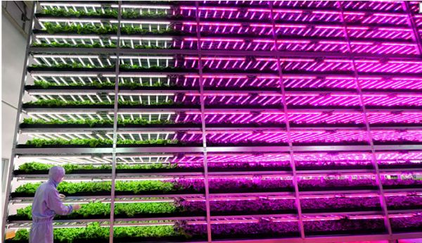
Of all our collective moodboards the images that caught our attention were greenhouses that had interesting, coloured lighting. This seemed a good starting point for creating some usual scenes and atmospheres and was a large factor in the final selection of our greenhouse level.


After settling on a more solid idea we started to once again arranging a layout for the level and the pathways for the player. Becky, from the ideas discussed threw together some simple plans for what we had in mind with a summary for the player's journey.


We delegated work mostly by rooms, breaking off to each tackle a certain room and tasks to begin with. For my part I choose a feature that I had wanted added when we were suggesting ideas with was a flooded lower levels. I thought some corridors that resembled a sort of maintenance area for the rest of the facility would be a nice contrast with mechanical components and man made lighting to the organic shapes and natural light of the greenhouse upstairs.


Since these maintenance tunnels would be fairly sparse and populated with mostly modular components I also took the job of modelling the panels for the shipping containers that would be used to construct the level itself.  

Straight off the bat I knew I wanted the shipping containers to be almost completely rusted, not only to give an aged feel of having been sat there a long time but also with all the plant life to have remained so healthy the metal would be more exposed than normal to lots of water. I also looked into designing how the containers would have been modified for the environment the level was, such as wooden panels bolted to the floors for offices or for the greenhouse a grated floor to drain away water that might accumulate in there as well as how plant life would effect and interact with the materials they were surrounded by. While I worked on creating these panel pieces Becky set to work on blocking out a white box in Unreal 4 was we could start working out lighting and placements. Following the brief timetable we set up my panels had to be completed by the second week to allow us to continue to work with the lighting in a much more final setting.

By the end of the week I'd been in engine also, starting to try out materials for creating water for the flooded levels and stepping up blueprints in testing files to get doors opening and lights turning on which are simple enough. What I really want to try and get running is a way to add footsteps that change depending on what type of surface the player is walking on. The documentation I've found for it doesn't seem that hard for a 3rd person game but the fact we're working in 1st is complicating things. Other than this I finished the panel modelling ready for next week and have moved onto modeling my share of the assets to populate the level with.


Thursday, 11 December 2014

Dichotomy Project Post-Mortem

Final outcome

It's finally over and we may rest easy once again, for a few weeks anyway. It's no secret this project has been a persistent monkey on my back and I've been really unsure through this whole process but I did like what I finally ended up with.

Stonewall and Gambit
Overall they still have things I'm not completely happy with, mostly with my textures and mostly with Stonewall the white Bishop. The tone of the yellow on his body washes out into the white far too much and it makes the details harder to see. Gambit despite being textured in the same pattern feels like his colours are broken up more successfully and they sit together a lot better and clearer. It was also pointed out at the final presentation that the opposite tones on the shoes draw the eyes down towards them as the pure colours seem to demand attention.


In response to is I did a quick paint over of the render using shades of grey so that they colours weren't quite as strong. I to me looks like I'd have to spend some more time to get the shades correct but the alteration does seem to help balance the colour more and helps separate them from the board they're standing on.

The project over all

Regardless of the finished piece I don't think I handled this project as well as I should have done. I spent too long working with the concepts and even longed doubting any of the work I produced which greatly slowed everything down. 

As for the transition from 2D to 3D my models were quite close to identical to my plans and orthographic images so was happy with this aspect of my work and I wasn't required to alter my tri count for the models to get my desired results. I had wanted to get a bit more depth into the diffuse texture and get the glow maps working for the eyes but I was required to prioritise other things.  


Even with all that once the dust settled from concepting nightmares and deadline changes I laid out a work plan for the time frame I had left and was able to stick with it more often than not, apart from a few hurdles at the end which affected the quality of the model rigging. 
For the next project my main goal will be to not trip myself up with concepting for disproportional amounts of time once again and to have a bit more confident to avoid hesitating the point of being static. 

Monday, 8 December 2014

Bishop Modelling Continued

It's been a long project but the end is finally in sight. This is just an update to add onto the last post to cover the second character. Both characters are modeled and textured and all that is left is to use the extra time to rig the characters and produce quick props and a base to use in my renders. Overall I do like the designs but I think the black bishop works better of the two, his silhouette seems stronger and his colours work better together. I look forward to getting them side by side in a scene and wrapping this project up.


Wednesday, 3 December 2014

Bishop Modeling

Modelling for the rest of the week and the weekend went with no problems. Having modeled the white bishop I could carry the model over and swap out the head pieces then use the various tools to make the other changes to produce the second character. 


I set a budget of under 3000 tris for each model. The white bishop finished at just over 2500 and the black bishop was under 2700. I cut the count down as much as I could to the point where anymore changes would change the shape of the model, though I did upset the topology on the head and feet in an attempt to lower the count..  
I used the symmetry modifier to cut down of modelling time and the time spent working on the unwrap but got to the texturing stage and realised my texture design was asymmetrical so couldn't overlay the UVs and had to go back and repack them a few times. 

I initially created a PBR map for the white bishop but the result wasn't the cartoon like feel I was aiming for so I returned to diffuse and specular maps. 

Uvs, Diffuse and Specular map
I also intended to use a glow map to try and get a slight glow on the eyes so they didn't look so flat and painted on but I couldn't manage to get the map working in 3Ds Max so I abandoned the idea. I had planned to just finish off the texture for the second character in the next though days but the project was given a extension so I should have time to rig the models and create props to use in the renders. There's still work to do but it's nearly at an end and I really look forward to a break for Christmas.

Wednesday, 26 November 2014

Abandon hope all ye who enter here

The week so far has been rough with 40% on my time spent still working on a concept and the remaining 60% screaming into a pillow about my concepts. I've over thought everything to the point of feeling completely lost in it all. I don't seem to be the only thing getting a little lost, dichotomy itself seems to have gone on a journey through Chinese whispers about how different the characters actually have to be and there seems to be a huge focus on scale (no pun intended), leaving me fairly certain once again about my design as sitting in a room full of people who say it's not different enough tends to do.


After returning to the shapes again I instantly hit the same unyielding brick wall of seeming not to move forward. The ideas just weren't coming and by midday Tuesday there wasn't anytime to dwell on it any longer. I hadn't walked away with a lot of ideas for the shapes so with my minimal options I went with what I thought was the strongest one being, chess. A lot of the shapes reminded me of various chess pieces and by this point I needed something to go with.

Face Off dichotomy
Having been showed an episode of a special effects show called 'Face Off' by one of the tutors in the Wednesday lecture, where contestants had to design a pair of characters that were basically, good and evil but clearly belonged together, I took from it my idea would work well as a dichotomy to have these same pieces that must play for different sides. I designed a few different pieces, mostly the Bishop and the Knight and decided the Bishop had the most potential to work with in terms of shape and design.
This also fit well into my time frame. I'd lost a huge amount of time struggling with the concepting stage and now had a small window for modelling. I wanted to make both characters, it seemed redundant to me to design a character whose purpose is to be in a pair and to only have the one in the end. The overall similarities of the designs mean I can carry the first model over and make alterations instead of making a whole new model from scratch.


I moved through the rest of the work fairly quickly and didn't get to explore as much as I could with the costumes. My main focus was trying to make sure the tonal values from the first character was inverted for the second to create that link between them with the colour palettes. 


My final colour choice was purple and yellow. Since nearly everyone when asked selected the purple for the black bishop I wanted to use the contrasting colour for the white. With the orthographic images complete I can finally move onto the modelling which after all this trouble with 2D will be a much welcome break..